Building the whole stack: seven messy sources to a live dashboard
After owning the business logic of an enterprise footfall model, I built an entire analytics platform myself: synthetic data, medallion pipeline, star schema, and a React dashboard. With AI as the pair-builder and my judgement as the safety net.
Everything in this project is synthetic. Al Waha Park is a fictional business, and every figure in it was generated by code I wrote. It is not based on any real company’s data.
In my last post I described owning the business logic of a footfall model across 60+ brands at Alshaya. I defined what the numbers meant, validated them, and root-caused them when they went wrong. But I was the business analyst and product owner for that one model, sitting alongside a data architect who designed it, data engineers who built the pipelines, and BI developers who put it on a dashboard. That is how it should work at that scale, and it left me with a fair question about my own range: could I hold all of those seats at once?
The honest way to answer was to build one, end to end, alone. Seven source systems, two years of deliberately broken data, a Python pipeline landing it raw and modelling it into a star schema in Postgres, and a React dashboard on top. The whole thing runs from two commands.
Open the live dashboard (interactive, no login) · Code on GitHub · Video walkthrough
If you would rather watch than read, this is the whole project in about four minutes: the dashboard, the source files, the pipeline, and the database behind it.
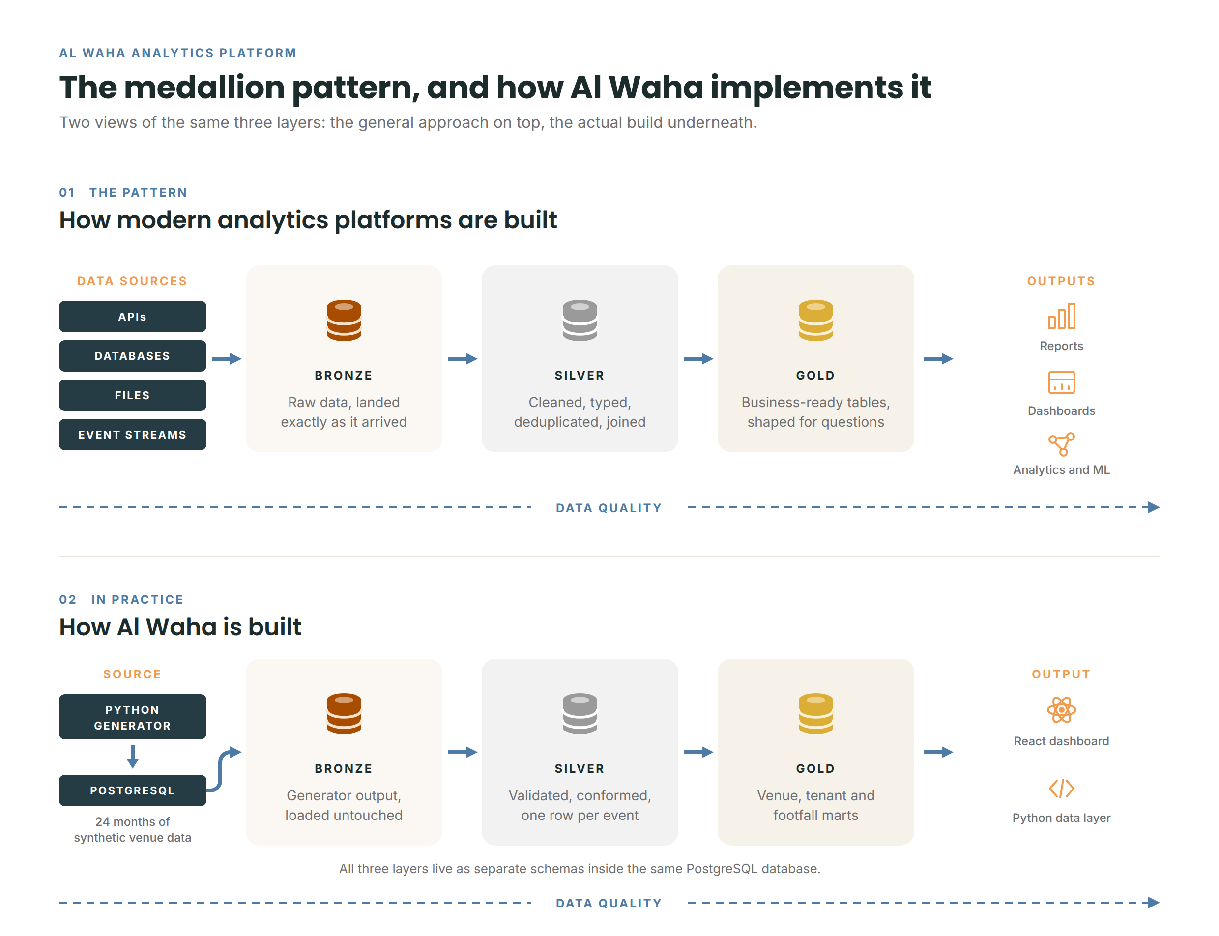
Here is the shape of the whole thing before I go into any of it. The top half is the pattern most modern analytics platforms follow. The bottom half is what I actually built.
Why a destination operator
I could have modelled a shop. I chose something harder.
Kuwait has a category of business that is part landlord and part operator: outdoor lifestyle destinations like Murouj, where leased restaurants and retail sit alongside venues the company runs itself. It is a genuinely awkward data problem, which is exactly why I picked it.
Al Waha Park, my fictional version, has ten leased tenants paying base rent plus turnover rent (a percentage of their sales), four own-operated venues (a playground, a farm, a gym and an equestrian centre), a booking website, four footfall gates and a Dynamics 365 style ERP.
That structure forces problems a single shop never would:
Two revenue models under one roof. Own venues take money directly at the till. Tenants report their sales to you monthly, in their own formats, late, and sometimes revised afterwards.
Different businesses on different seasonal curves. The outdoor park collapses in a Kuwaiti summer. The equestrian arena is air conditioned, so lessons continue year round with only a modest dip when families travel. Horse boarding is completely flat, because horses stay stabled whatever the weather. One shared seasonality factor would have been wrong for three of the four venues.
Capacity, not just volume. A riding lesson slot has fixed places and an instructor. An empty advanced slot costs the same to run as a full one. Utilization needs a model of what could have happened, not just what did.
Breaking the data on purpose
Clean sample data proves nothing, so the first thing I built was a generator that produces two years of source files with the flaws a real business would send:
- One footfall sensor dies for 48 hours; another double counts for a fortnight
- The same gate arrives as
Gate 1,GATE_1andG1from different vendor exports - POS lines duplicate where re-exports overlap
- Tenants file sales five to forty days late, in inconsistent columns, one of them weekly instead of monthly, some restated afterwards
- Refunds arrive as negative quantities, mixed in with real sales
The harder part was making the tables cause each other rather than exist independently. Footfall drives POS sales. Weather suppresses footfall. Events lift it. Web sessions lead bookings. Without that causal chain, footfall-to-sales conversion would be noise and every insight on the dashboard would be decoration.
I also buried findings in the data deliberately: a tenant reporting sales well below what its footfall share implies, beginner riding lessons near capacity while advanced slots sit half empty, a July concert that lifted traffic and still lost money. Those are what the dashboard is supposed to surface.
The model
The pipeline lands everything raw (bronze), cleans and flags it without ever silently dropping a row (silver), and models it into a star schema (gold). All three layers live as separate schemas inside the same Postgres database. Seven fact tables, deliberately spanning four different types:
Two decisions in the model are worth explaining, because they are where this stops being mechanical.
To answer a simple question like “how many members did we have last March”, I store one row per membership per month. It sounds obvious, but the alternative, recording only joins and cancellations, means every historical count has to be pieced back together from events. Storing the monthly picture turns the question into simple counting. And gym memberships and horse boarding, which look like unrelated businesses, turn out to be the same shape underneath: a recurring monthly payment that people eventually stop. They share one table.
The second decision is about history. When a tenant changes category or closes, I keep the old version rather than overwriting it. So a report on last January still shows that unit as the coffee shop it was then, not the dessert shop it later became. Overwriting would silently rewrite the past, and quietly moving old sales under a new label is one of the most common mistakes in this kind of modelling.
The correction that deleted Friday nights
One story from the build is worth telling properly, because it is the moment the project earned its keep.
The generator plants a sensor that double counts for two weeks, so I built an outlier rule to catch it: flag any hourly reading far above the rolling average, and correct it. It ran cleanly and the tests passed.
Then I checked the output against the business instead of the tests, and found this: a normal winter Friday, main gate, seven in the evening. The sensor read 412 people. My rule had quietly “corrected” it to 266.
Nothing was wrong with that sensor. Friday evening at a Kuwaiti outdoor destination simply runs at about 1.6 times a weekday, and my rule was comparing Friday nights against an average that blended Tuesdays into it. It could not tell a broken sensor from a busy night, so it was flattening the busiest hours of the season, on every gate, and passing every test while it did it.
The fix was one idea: compare like with like. Same gate, same hour, same day type. A doubled Friday still stands out against other Fridays, and the genuine peaks survive.
In my footfall post I wrote that you cannot add unlike things and expect the number to mean anything. Six months later I broke that exact principle in my own code. The lesson is not “test more.” The tests were fine. It is that a statistical rule without domain knowledge will confidently destroy the signal it was built to protect, and the only thing that catches it is knowing that Friday is different.
Where AI fit in, honestly
I built this with Claude Code as a pair-builder, and I want to be precise about what that means, because it is the part of the project most relevant to how this work is changing.
The AI wrote most of the code, fast. What it could not do is the part that mattered. It did not know that Kuwaiti weekends run about 1.6 times weekday traffic, that Ramadan shifts activity late into the night rather than reducing it, that horse boarding is flat while everything around it swings with the season, or that a tenant’s reported sales should be read against its footfall share. Every one of those came from me, and the Friday-night bug above is what happens when the generated code runs ahead of the domain knowledge.
I kept one rule throughout: nothing gets committed that I cannot explain line by line. The AI accelerated the build from months to weeks. The judgement, the business rules, and the catch when they were violated stayed human. That division of labour, direction and verification over typing, is what I think this job increasingly looks like.
The dashboard
I deliberately did not use Power BI, even though it is my strongest tool. The question was whether I could build the interface as well as the data behind it, and Power BI would have let me skip that question.
So the front end is React and TypeScript. Python exports the gold layer as static JSON files, and the dashboard reads those. Nothing in the browser touches the database, which means the page loads instantly and does not depend on a database staying awake. There is no charting library either: the scales, ticks, line paths and bars are hand-written, because a chart is not complicated once you understand what it actually is.
Six sections: footfall and venue sales, leasing and tenants, an interactive site plan, online bookings, membership and equestrian, and data quality. Three things in it are worth pointing out.
The time selector is the seasonality. Twenty-four months across the top as bars, coloured for peak season, shoulder and summer trough. Click one or drag a range. It is a filter that also states the thesis: at this business, the season decides everything. Put July next to February and it looks like two different companies.
The site plan is drawn, not charted. A general manager thinking about a destination pictures a map. Tenant plots are drawn to scale by leased area and coloured by whichever metric you choose. Leasing is a spatial business, and “which units get walked past but not walked into” is invisible in a table.
The data quality page does not open with a wall of green. It opens with what went wrong: 14 source problems, 12,397 flagged records, each with what happened and what the pipeline did about it. The 27 passing checks come second, on purpose, because a page that leads with green ticks invites exactly the wrong conclusion. The checks pass because the mess was handled, not because the data was clean. A tenant under-reporting every single month passes every check on that page. There is also a card listing what the dashboard cannot tell you, which I think every dashboard should have and almost none do.
Open the live dashboard · Watch the walkthrough
What the build taught me
Build the thing you have only ever validated. I knew what a silver layer was because I had chased bugs through one. Writing the transformations myself taught me how many small decisions live inside “clean the data”, and that each one is a judgement you must be able to defend.
Do it on boring tools first. No Spark, no dbt, no orchestration framework, no Fabric. Just Python, pandas and Postgres, deliberately. Medallion layers, grain, slowly changing dimensions and quality gates are concepts, not product features. Having built them by hand, the managed platforms stop being things to learn and become the version of this that someone else maintains. That is a far better position to pick up Fabric from than the reverse.
Check your rules against the business, not just the tests. The outlier rule passed everything I wrote for it while deleting the busiest nights of the year. The tests were fine. The assumption underneath was not.
Nothing here is hardcoded to Al Waha. The client name, the venues, the seasonality curves, the source formats and the metric list all live in one configuration file. The site plan is data. The branding comes from config. The built dashboard contains no reference to the business it is describing, because every one of those strings arrives at runtime. Pointing this at a different operator, a retailer, or a business with an entirely different shape is a configuration exercise, not a rebuild. That was the real test of the design, and it is the part I would carry into any client work.
← Back to Projects